Project 1a:
Charts and Graphs
(instructions)
Background
There is a significant labor crisis brewing in Major
League Baseball, and many distinguished baseball analysts feel that the players
will strike before the end of the summer.
It is therefore imperative that the players association and the owners
meet to reconcile their differences as soon as possible. Bud Selig, the MLB Commissioner, has
contacted me and requested that I provide him several charts to assist him in
the negotiations. The following will be
provided as required by this exercise:
frequency table/histogram chart, bar chart, pie chart, line graph, and
scatter plot.
Data Source
Mr. Selig has provided me with various data on all MLB
position players (pitchers were excluded).
The data provided includes each player’s league, team, position, 2002
annual salary, 2001 batting average, and 2001 homerun total (player stats for
this project are fictitious). Please
click here for the
specifics on each athlete.
Frequency Table /
Histogram
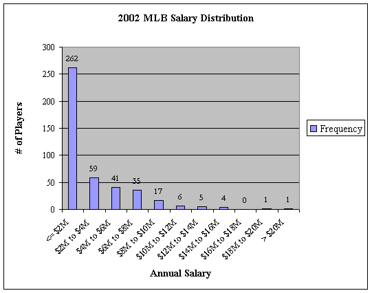
The following table will provide Mr. Selig with the frequency of player’s annual salaries. As you will see, the vast majority of players make less than $2 million annually, whereas only a handful make more than $10 million annually. The histogram chart which follows presents the information in a slightly different manner, but the results are the same nonetheless.
|
2002
MLB Annual Salary |
|
|
Annual
Salary |
Frequency |
|
<=
$2M |
262 |
|
$2M
to $4M |
59 |
|
$4M
to $6M |
41 |
|
$6M
to $8M |
35 |
|
$8M
to $10M |
17 |
|
$10M
to $12M |
6 |
|
$12M
to $14M |
5 |
|
$14M
to $16M |
4 |
|
$16M
to $18M |
0 |
|
$18M
to $20M |
1 |
|
>
$20M |
1 |
As illustrated by the skewness of the histogram below, it looks as though the players might have a legitimate argument and that many of them are grossly underpaid. Just under two thirds of the players make less than $2 million annually, what an injustice!!!
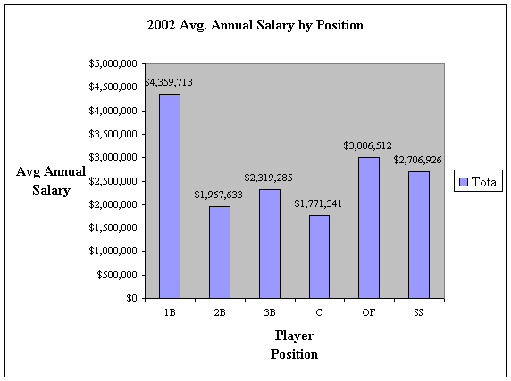
Bar/Column
Chart
Mr. Selig is curious as to which positions are earning the largest annual salaries in 2002. The column chart provided below shows that first basemen are earning the most, averaging nearly $4.4 million a year. Catchers, on the other hand, are at a scanty $1.77 million, and they are followed by second basemen who earn a very humble $1.97 million annually. It could be suggested that the catchers and second basemen have genuine gripes in the labor dispute.
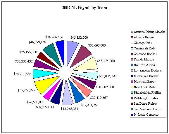
Pie Chart
Mr. Selig is also very interested in overall team
payrolls. Specifically, he finds that
he is overwhelmed with boredom each October when it seems as though the same
teams are competing for the World Series.
Provided below are two pie charts depicting the 2002 player payrolls for
each MLB team. The first chart shows AL
teams, and is followed by the second chart which shows NL teams.

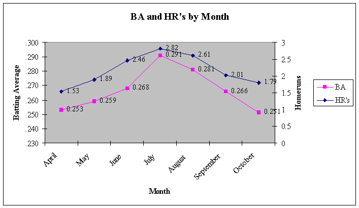
Line Chart
Mr. Selig has also expressed interest in studying which
times of the season the players are performing the most for their dollar. As depicted by the line chart below, the
most prolific months during the season are the summer months. Peaking during July, batting averages and
homeruns per month are at .291 and 2.82, respectively. Each is remarkably lower in the beginning
and ending of the baseball season. The
argument could be made that it takes the players a couple of months before they
find their rhythm with the bat, and that after several months their numbers
begin to lag a bit due to the long and tiring season. Another argument could be made that the low temperatures in the
beginning and ending of the season affect the players’ productivity. However, a further analysis would be
required to show either argument.
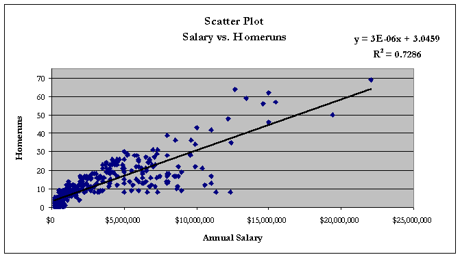
Scatter Plot
Finally, Mr. Selig is curious whether the players who are earning the highest annual salaries are also displaying the most prolific numbers. The scatter plot charts provided below show that there is correlation between a player’s salary and their batting average and homerun productivity.

The above chart shows that there is a close relationship between batting average and annual salary. Although the slope of the trend line is very small, it does steadily climb upward. The below chart shows a similar correlation between homerun productivity and annual salary. The data illustrated by both charts combined suggests that the most prolific players are being compensated by the most money.